Have you ever questioned why more of the traffic you receive doesn’t result in sales? The most frequent causes include lousy website navigation, sluggish page loads, and poor online design. Here is some Great Ways To Improve Your E-Commerce Performance.
When website users arrive on a page, they encounter confusing navigation, no on-site search, and a number of messages that don’t make it clear how to get the desired product or service.
These circumstances will become better with the correct calls to action (CTAs).
A CTA is a link or button that directs website visitors to specified web pages or launches a particular activity. It’s similar to informing folks where to click to purchase a good or perform another beneficial action. CTAs, for instance, can be seen in adverts, product descriptions, and pop-ups for email subscriptions.
A CTA in eCommerce is equivalent to conversions. More consumers will make purchases on your website as long as you configure them well. And there are several factors to take into account, like color and screen positioning.
We provide this manual on the best practices for improve your E-Commerce performance as a result. Real-world examples that demonstrate how firms use these buttons to boost sales and subscriptions may be found online. These suggestions may help you determine what needs to be changed on your website, whether it’s a product page, home page, or landing page.
7 Tips for improve your E-Commerce performance to Increase Conversions
Want to increase sales? Here are seven CTA suggestions you may use to enhance the eCommerce UX of your online store.
You may have observed that certain language appears on many websites. Online retailers utilize a particular set of terms and phrases on their pages because they are the most effective.
Such language is common, therefore it doesn’t require much effort to understand what the term means. People may not convert if they hesitate for even a few seconds, thus consumers may respond more positively to well-known terms.
What can you write on buttons to make it easier for potential buyers to understand? These may include the following:
One of the simplest ways to persuade visitors to stay on the website and view more content is to say,
- Learn/Read More – This delicate phrase may be used on home pages, product advertising, blogs, etc. since visitors are not required to provide any information or put products in their shopping carts.
- Join Now – (often followed by the term “Free” to further entice customers). This button might request that users provide their email addresses in order to join a rewards program or receive deals before everyone else.
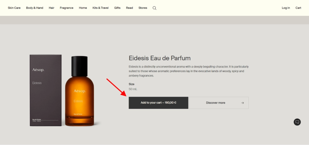
- Add to Wish List/Cart – Users can save items in a special area where they can evaluate the desired items by adding them to their wish list or shopping cart. This button is the biggest and brightest on the page because it can be the most significant.
- Buy now – Some online store owners choose to make the purchasing procedure simpler. By indicating that consumers should continue to the checkout page after clicking this button, it eliminates certain stages of the purchasing process.
The Hestan website has sections like “Shop Nanobond,” “Compare the Cookware,” “Learn the Hestan Difference,” and others.
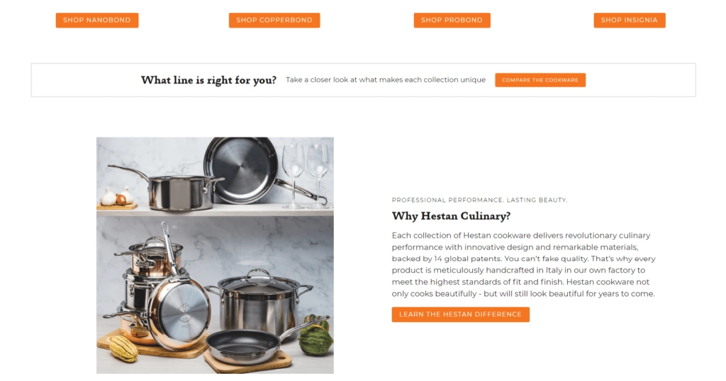
Which button will work best on this page depends depend on where the visitor is in the sales funnel.
For example, On the home page, you can skip the “Add to Cart” button if you’re a first-time visitor. They require time to browse the catalog and evaluate the products, costs, and reviews. Due to the fact that email subscribers are already familiar with the company and its offers, email copy may be a preferable place to include these CTAs.
By addressing readers directly, you can improve your E-Commerce performance. Personalization is the term for this strategy. To draw readers in, you can use personal pronouns like “Add to Cart,” “Sign Me Up,” “Choose Your Perfect Mascara,” and similar expressions. A study found that individualized calls to the action performed 202% better than conventional CTAs.
An example of a personalized CTA on an online store is shown below. Visitors to websites are more at ease when the call to action has a customized touch. They feel a connection to the brand, which fosters more trust.
2. Position CTAs in Locations That Will Get the Most Clicks
A great call-to-action button should be noticeable enough to draw website visitors in right away. Customers could find it challenging to view your button if it is small and there are many other features on your website.
In addition, if something is not immediately apparent, users can conclude it doesn’t exist. They won’t be able to do anything else because there are no instructions. You ought to adhere to predictability because of this. Place items where customers would anticipate finding them.
A CTA, for instance, ought to be visible above the fold. This means that it should be located higher on the page so that users may see it without having to scroll down after the page has loaded. Your prospects will probably notice this location first when they visit your store because it has been proven to be the most successful.
Product pages are another web design practice. Customers anticipate seeing one or two CTAs beneath a brief description and to the right of the product image.
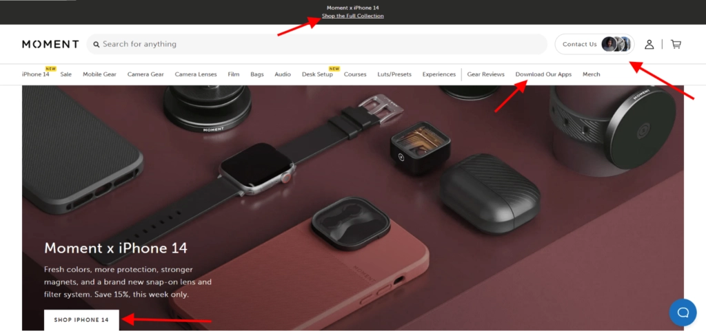
The top of the Moment store features a call-to-action button and all of the menu selections. The products are highlighted in the hero image, and the language is succinct and direct.
3. Consider the Button Hierarchy When Creating an Ecommerce Call to Action
If there are several CTAs on the page, it should be obvious what order they come in.
Secondary CTAs could become blander, smaller, or reduced to text links, which would detract from their visual attractiveness.
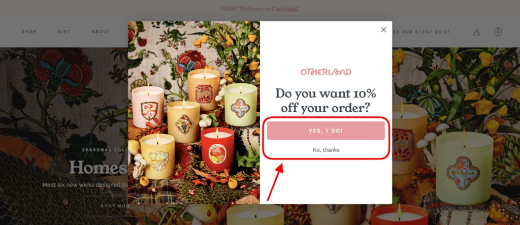
Consider the email subscription pop-up that is shown below.
The “Yes, I Do” button’s placement and contrast with the page make it clear that Otherland wants viewers to click on it.
“No, thanks” is the same size as the main CTA, but it only appears as a ghost button that blends into the background.
4. Ensure Clicking a CTA Requires Minimal Work
Interacting with your business should be straightforward for potential customers. People are more inclined to click on a button if there is no complicated action required of them. You also have the opportunity to send them to a landing page and convince them to make a purchase.
By offering something of great value, you may entice customers to stay in touch with your company.
Everyone appreciates a freebie or a way to save money, right? Give your clients these benefits in exchange for low-value or low-effort actions, like subscribing to your email list or following your company’s social media accounts.
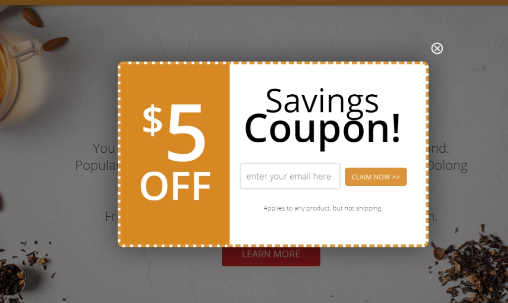
Here’s an illustration of a low-risk offer. After leaving their email address, customers receive $5 off at the Adagio store.
5. Create a Sense of Scarcity and Urgency
Increase conversions by making the offering available for a limited time. Due to the limited offers, there is a high sense of want for the product and FOMO. Since it has a well-known psychological impact, internet retailers frequently use it.
You can select numerous options to present the information at various phases and to capitalize on a sense of urgency or scarcity. On home pages, buttons like “Shop Now” are frequently seen. On product sites, text such as “Ends shortly,” “Purchase till 9 PM,” or “Only three items remain in stock” can be found.
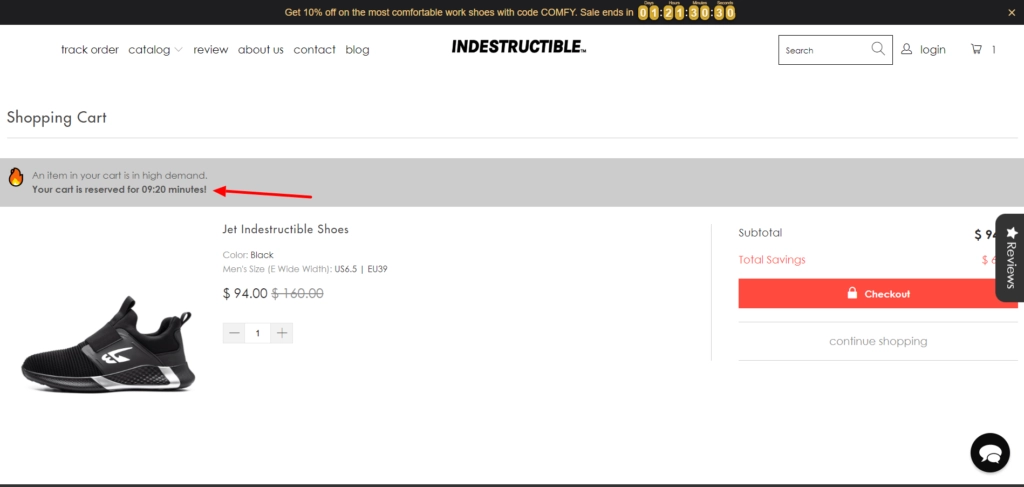
To hasten decision-making, you can add these words to the cart page or create customized “The cart is reserved for 60 minutes” messaging.
See how Indestructible Shoes makes use of this tactic. After 10 minutes, the things in the cart disappear.
6. Be sure to use the proper size, shape, and color.
Does your eCommerce performance stand out on the page?
Depending on the layout and prominent colors, the CTA should be obvious. It should also say that you can click. For instance, you may put it in the customary pattern for links, which is underlining, or in the rectangular or rounded shape of a button.
What shade of color ought to be used for the CTA? It all relies on the color design of the website. However, you can choose other contrasting hues or match them to your branding. Green and red typically show the highest conversion rates.
The negative space next to the CTA serves to highlight and increase its visibility. Keep the button size in mind. It should be reasonable and complement the other website components effectively. Keep in mind that larger CTAs have a higher chance of being viewed by your prospects than smaller ones do.
The size selected also affects how mobile-friendly the website is. Therefore, too-small links can reduce mobile conversion rates. Larger buttons are necessary for smartphone users to click on small screens.
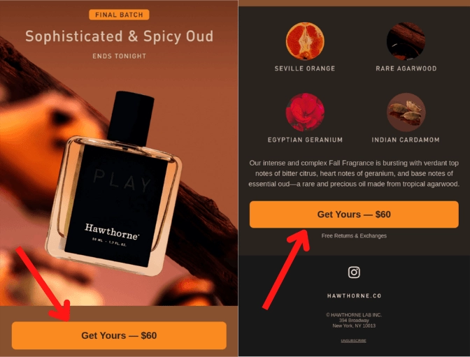
See how Hawthorne uses buttons in its email newsletter in the example below. Due to the button’s stark contrast with the background and size, the receiver can quickly identify it and even notice the item’s price.
7. Use A/B testing to find the most effective call-to-action for e-commerce
Unsure of what will appeal to your target demographic the most? Do you believe that more possibilities might increase sales? Until you locate the best CTA button or link, try out a few.
There isn’t one conversion-boosting tactic that works for everybody. But it’s important to pick buttons that are relevant to visitors and reflect your brand.
The only way to be sure is to experiment. Run tests to find the configuration that produces the most conversions, then change the CTA’s wording, color, form, or location. One such instance is A/B testing of calls to action for online stores.
Comparing two iterations of one element is the basis for this testing. You can only test one aspect at a time. To prevent distorted results brought on by seasonal variations, both versions should be utilized simultaneously.
Imagine showing one audience a circular button and another one a rectangular button. The responses of the public (such as click-through rates, for instance) might show which solution to use. The test could take some time. The more time that passes, the more precise judgments you might come to.
Three additional ideas to improve your E-Commerce performance
There are more methods to increase conversions besides CTAs themselves. When visitors encounter CTA buttons, the following advice will help you make a stronger impression.
1. Show ratings and reviews
People don’t always have the knowledge or time to choose the best goods. Will wash this outfit preserve its appearance? Will long-distance running damage these shoes? Our brain chooses the quickest route possible in an effort to conserve energy, such as social evidence and authority.
Reviews and ratings can assist you to increase conversion rates in this situation. Show the product description’s star rating and comments on the items. Additionally, callouts like “Bestseller” entice customers to make a purchase.
Displaying prestigious badges and accolades is another method to foster confidence. You can obtain them from well-known publications and organizations that attest to the excellence, longevity, and popularity of your company.
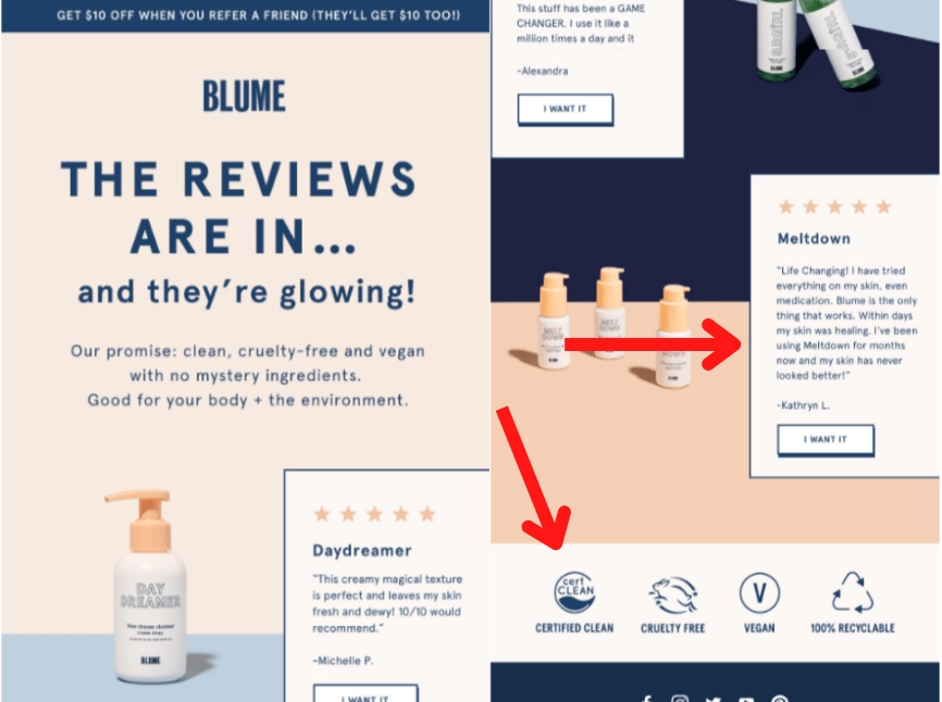
Look at the screenshot of the Blume email newsletter that is provided below. The business encloses eco-friendly labels in a letter to subscribers to reinforce its values and entice them to check out the products.
2. Minimize Uncertainty
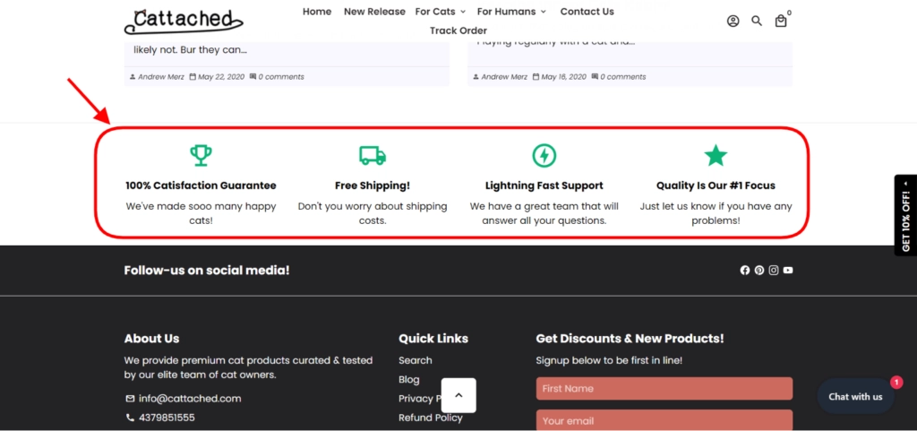
Some dangers may cause potential buyers to hesitate before making a purchase. What if they don’t like the product? What happens if they want to return it? By giving them the option to remove risk, you may dispel their skepticism in this situation.
Conversion rates will increase if visitors feel safer and are more inclined to take action on the page if they think they can “undo” their actions. For example, “Buy now, decide later” or “It’s OK to change your mind” return policies may be available. If customers change their minds after purchasing something, they can return it without facing any repercussions.
To improve your E-Commerce performance the number of people who click on an eCommerce call to action, make these promises visible. These words could also represent trust in your products and services, which would speed up the decision-making process.
Below is a screenshot of the attached web store to demonstrate what I mean. Point-of-action worry is reduced because you can obtain all the information you require about their return policy and guarantee.
3. Display More Details Next to the Button
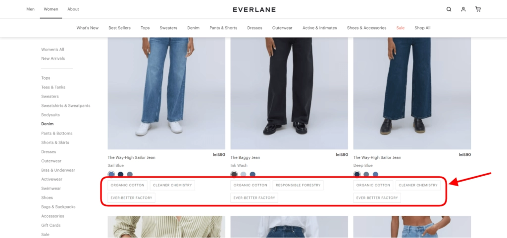
Additional information enables users to access information without visiting other pages. In some circumstances, this tactic might also increase conversions. Without reading huge blocks of material, readers may be confident in what happens after clicking the link. A brief footnote of fewer than 100 words may be used.
Display options for pricing, color, size, and quantity. Alternately, think of a novel idea that you believe could influence the way customers browse the merchandise. Here is an example of how Everlane uses this tactic on its product catalog website.
In this case, anchoring might also be beneficial. This procedure entails displaying the product’s original price alongside the discounted one. It resembles establishing a sense of urgency. Users risk missing out on the chance to purchase the goods at a good price if they wait.
Major conclusions
In eCommerce, calls to action are crucial to your conversion rate optimization strategy. They determine whether customers will proceed to the intended step, finish a transaction, or become disoriented and leave the cart. We’ve offered some suggestions for improving your links and buttons.
The fact remains, however, that no rule can be relied upon to predict which option will be more popular with visitors. Regular testing is necessary to determine what appeals to the audience.
Effective eCommerce calls to action can raise website metrics. They are present everywhere, including in shopping carts, checkout, and pop-up advertisements. To maximize return on investment, it is your responsibility to optimize them and improve your E-Commerce performance.
